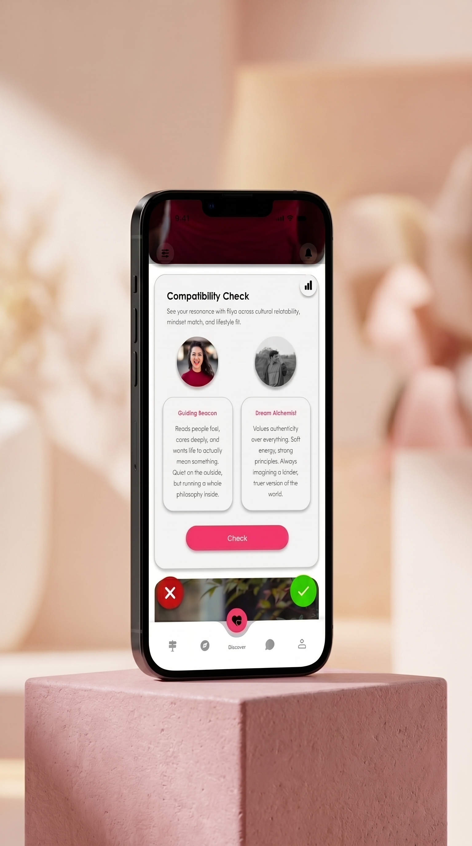
Compatibility Check
Compares cultural relatability, mindset matching, and lifestyle fit side-by-side to ensure relationship resonance before starting chat loops.
A Gen Z dating app designed around compatibility metrics, future goals, and relationship feedback loops instead of the superficial swiping loop. Live on Google Play Store.
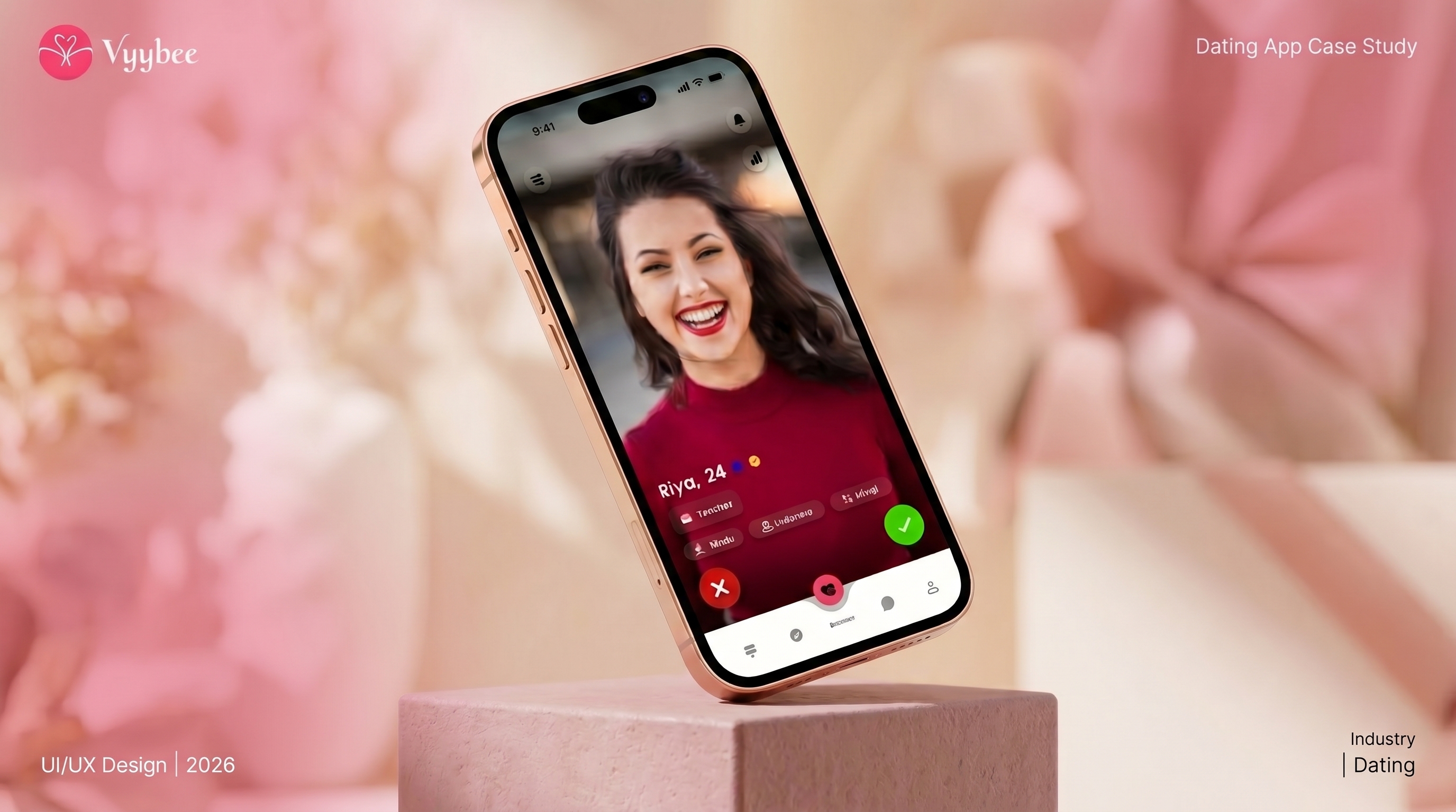
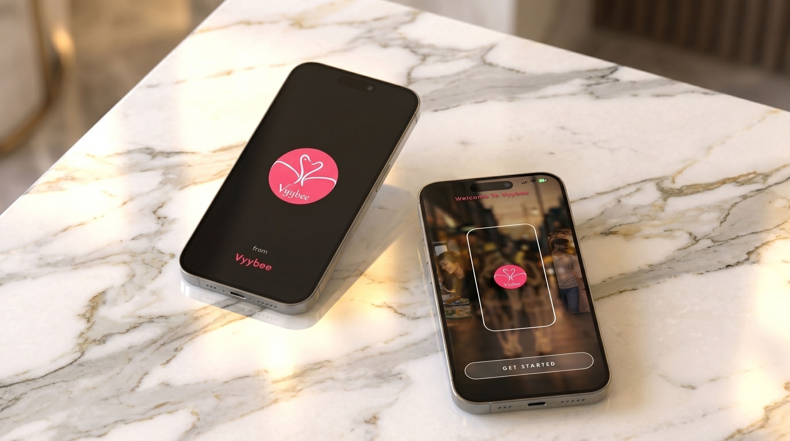
Vyybee is a Gen Z dating app designed around compatibility metrics, future goals, and relationship feedback loops instead of the superficial swiping loop. Below is a breakdown of the core user experience challenges and how the design system addresses them.
Traditional dating products stop at the "match." Gen Z users face severe swipe fatigue and superficial matches, leading to awkward, short-lived chats that rarely reveal real emotional or intellectual compatibility.
Design interactive matchmaking features—like Compatibility Check, Future Goals alignment, and Mind Reader quizzes—to initiate meaningful conversations and break the ice naturally.
Calculate and display a live Vibe Score based on real-time conversational activity, comfort levels, and interactive feedback loops to build trust and connection.
Design Concept
A mobile app for Gen Z requires a visual system that feels alive, premium, and interactive. The design blends dark translucent glass widgets, neon glowing connection curves, and emotional markers. It creates an interface that represents emotional chemistry dynamically, giving matching a tangible, playful feedback dashboard.
Key Features
Compares cultural relatability, mindset matching, and lifestyle fit side-by-side to ensure relationship resonance before starting chat loops.
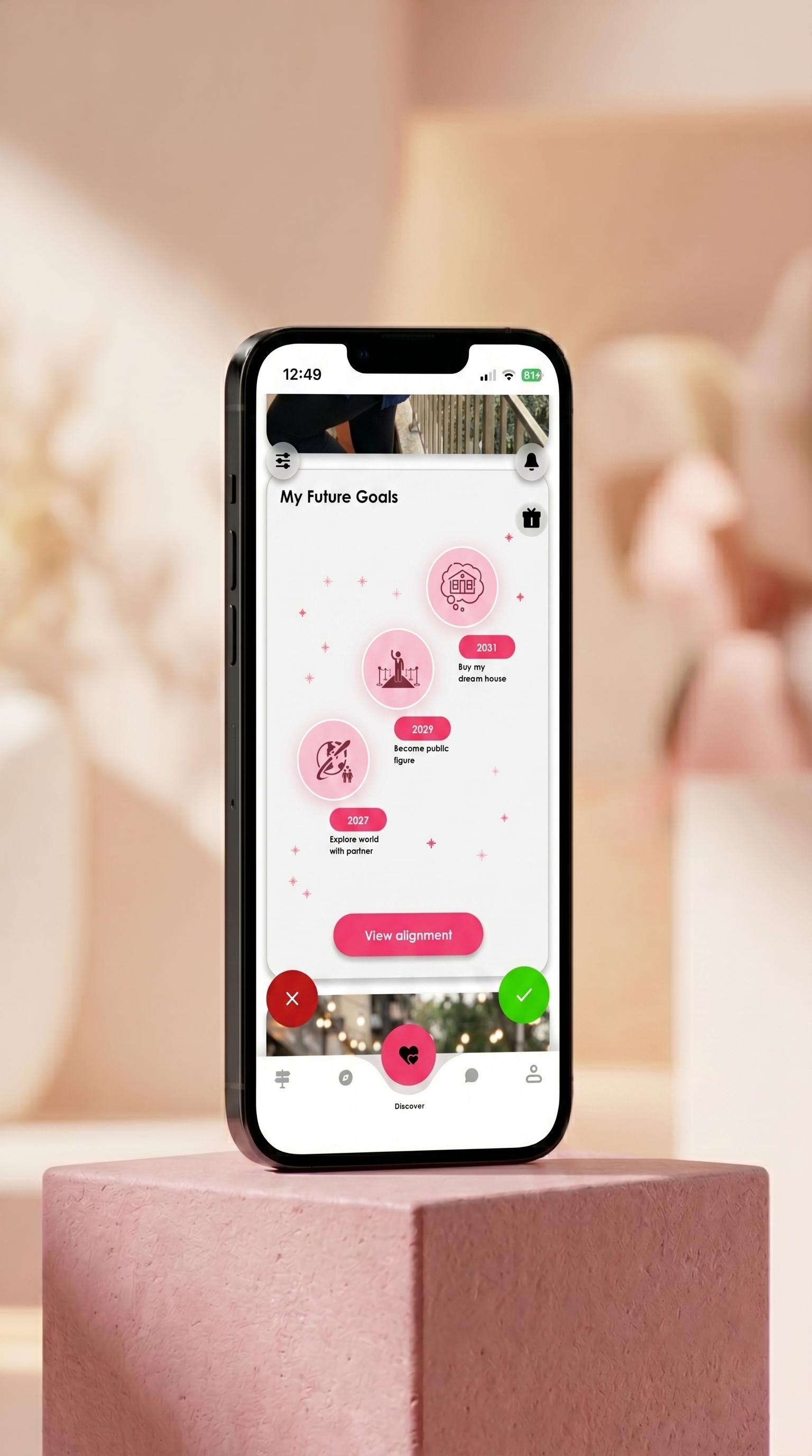
An interactive bucket-list map (e.g., buy a dream house by 2031, travel the world) showing alignment on long-term dreams and life plans.
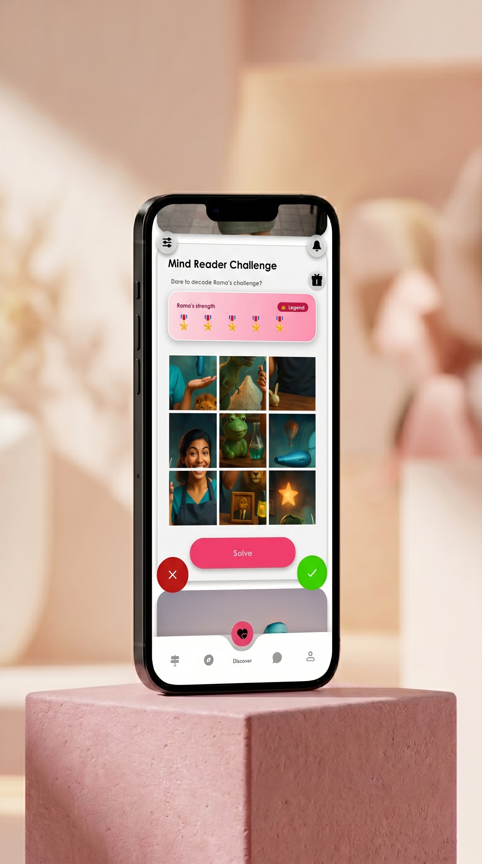
A playful challenge that quizzes users on what they think their match answered, sparking gamified chats and breaking the ice.
Case Study Complete
Vyybee represents the design thinking of taking an app to the playstore by offering interactive, value-focused screens. The final designs successfully launch a highly engaging ecosystem where users can evaluate chat comfort and compatibility in real-time.
Back to Projects