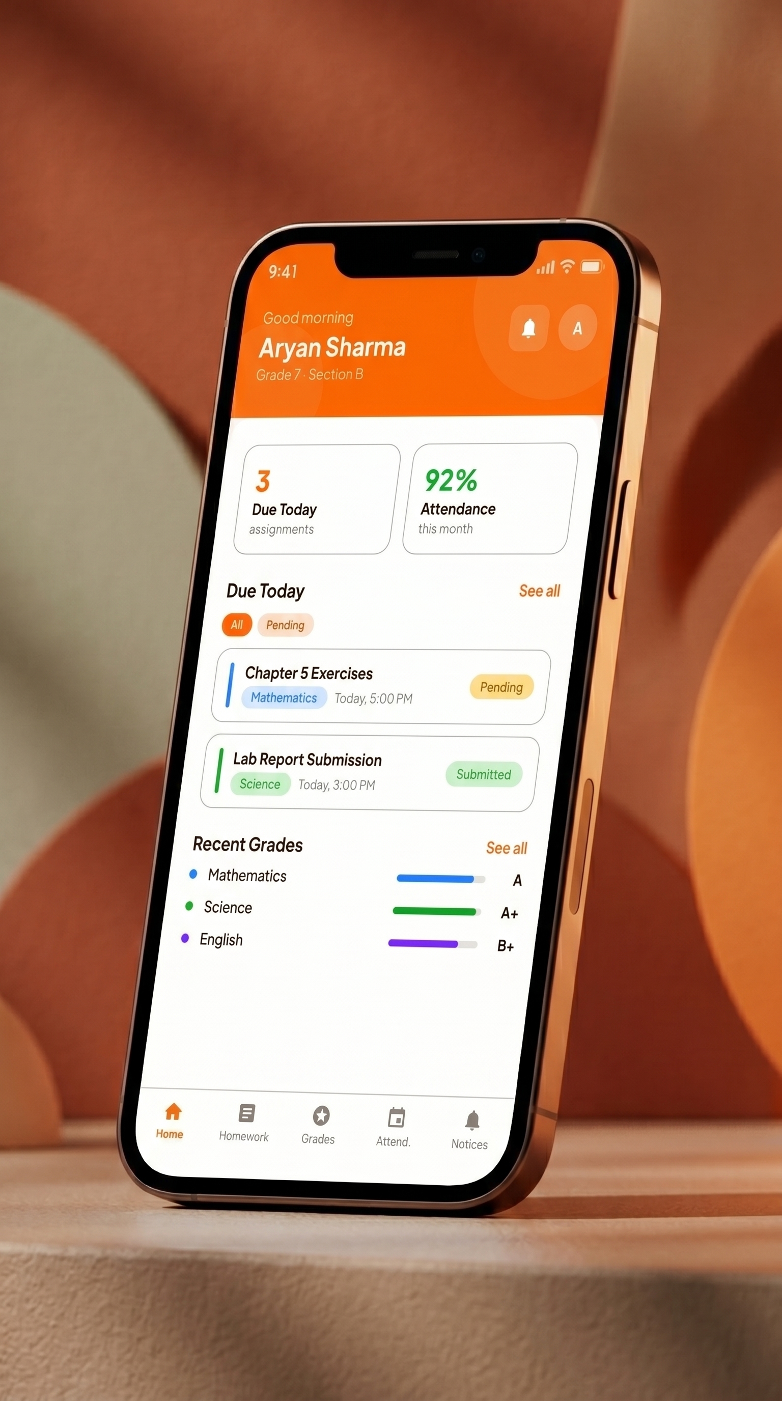
Student Portal
Clean class progress meters, pending digital homework cards, and immediate teacher feedback loops. Keeps students focused and organized.
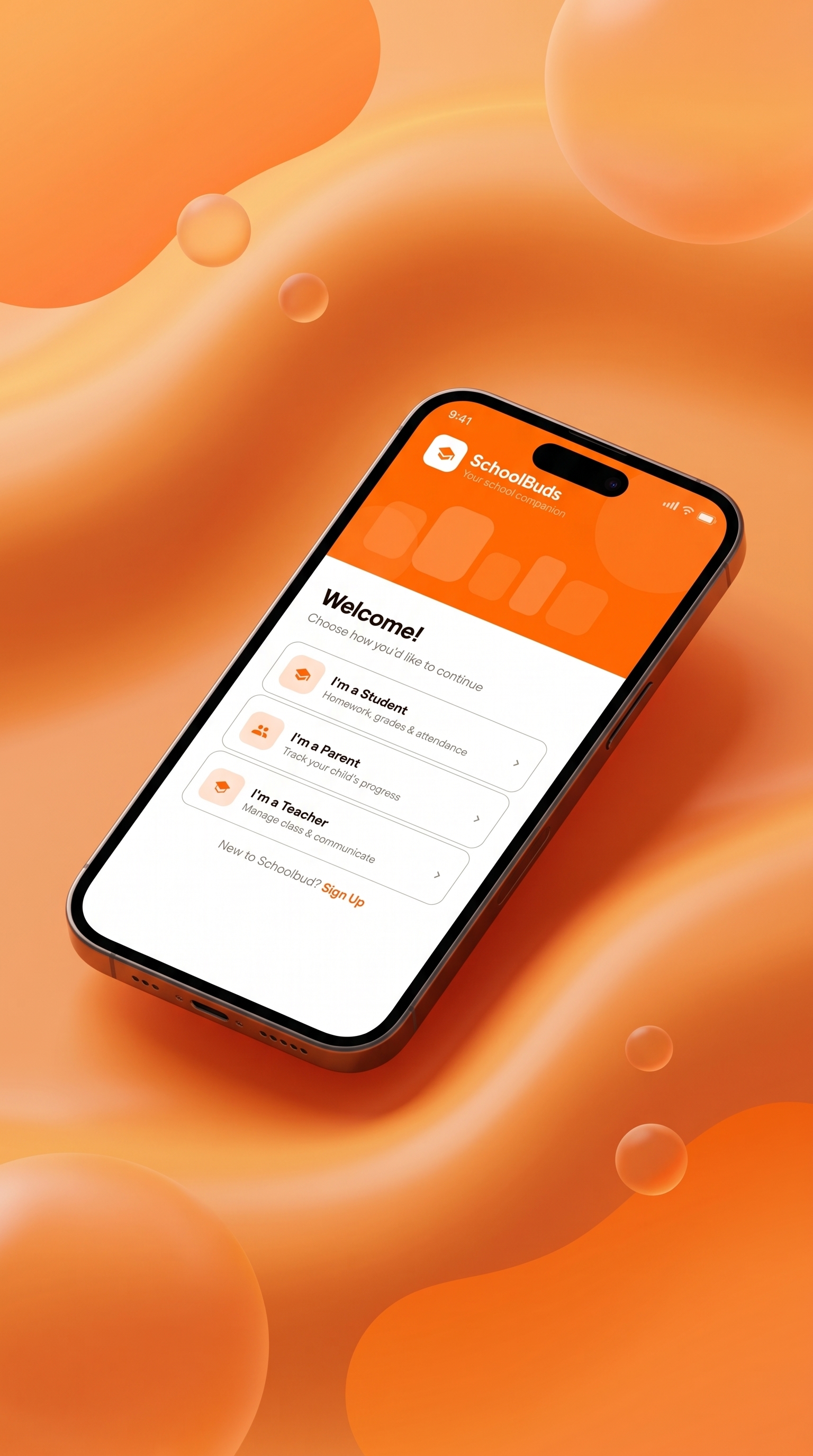
A modern school communication and student management SaaS platform designed to seamlessly connect schools, teachers, parents, and students through one unified, beautiful ecosystem.
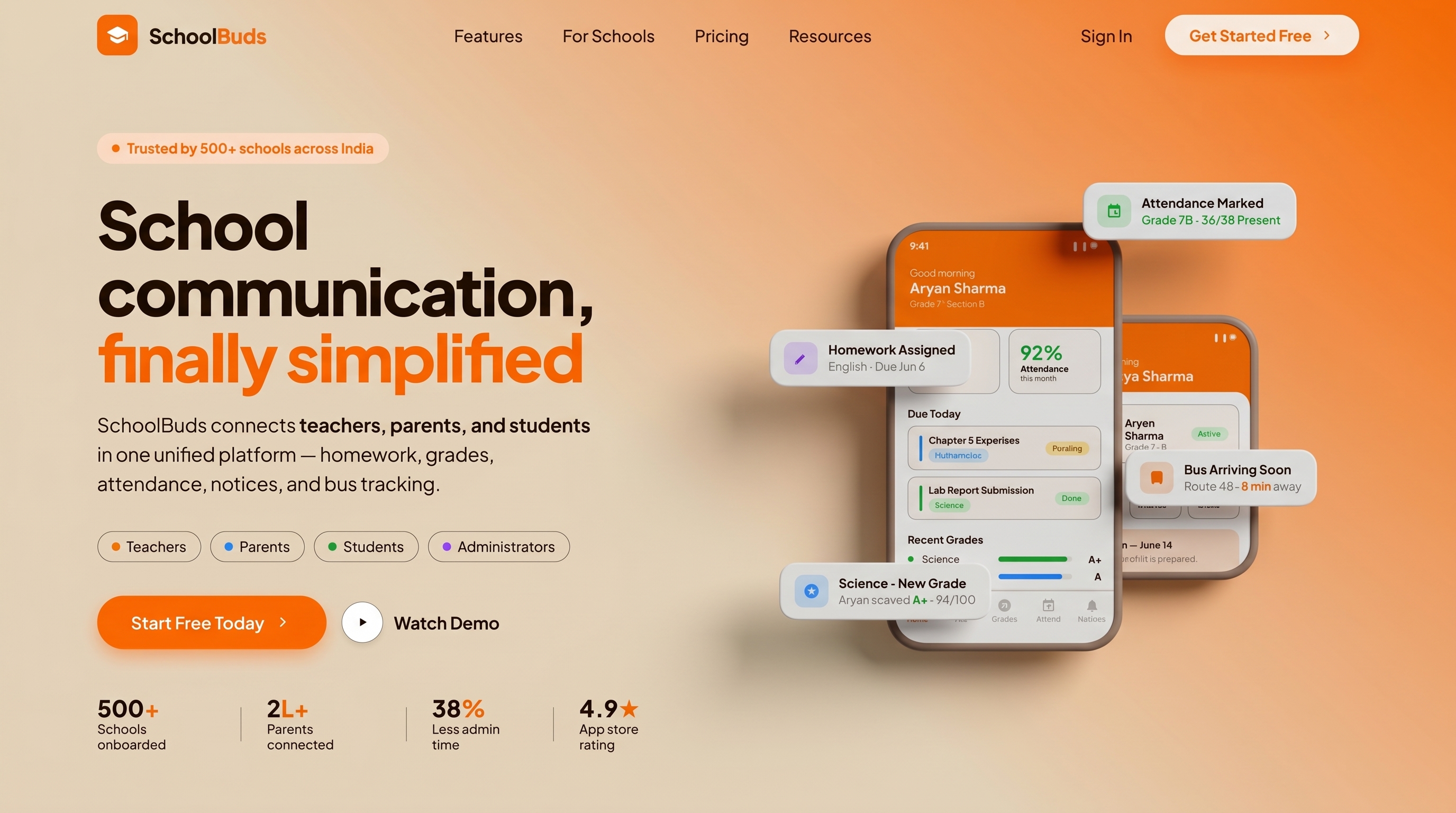
Schools often struggle with fragmented communication, manual administrative work, and a lack of transparency between teachers and families. SchoolBuds solves this by unifying homework, grades, attendance, notices, and real-time bus tracking into a beautiful, human-centric design system. The goal of this redesign was to transform a generic, overloaded teacher dashboard into a highly efficient tool, and establish a cohesive design system for all school roles.
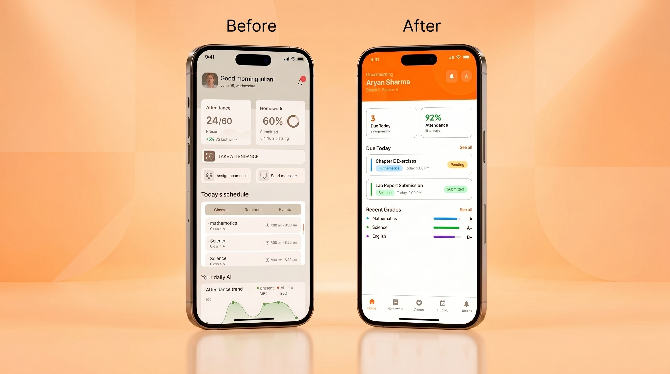
Legacy school portals suffer from severe information overload. Home screens display 12+ competing widgets, forcing teachers to scroll past student leaderboards and behavior donuts just to perform a 5-second attendance check. Parents also receive confusing data formats like "24/60 present" with no real-time safety tracking for school buses.
Redesign the teacher interface into 3 focused zones—Header (Identity), Quick Actions (Daily Tasks), and Today's Classes (Timetable)—reducing admin time and paper roll call down to single taps.
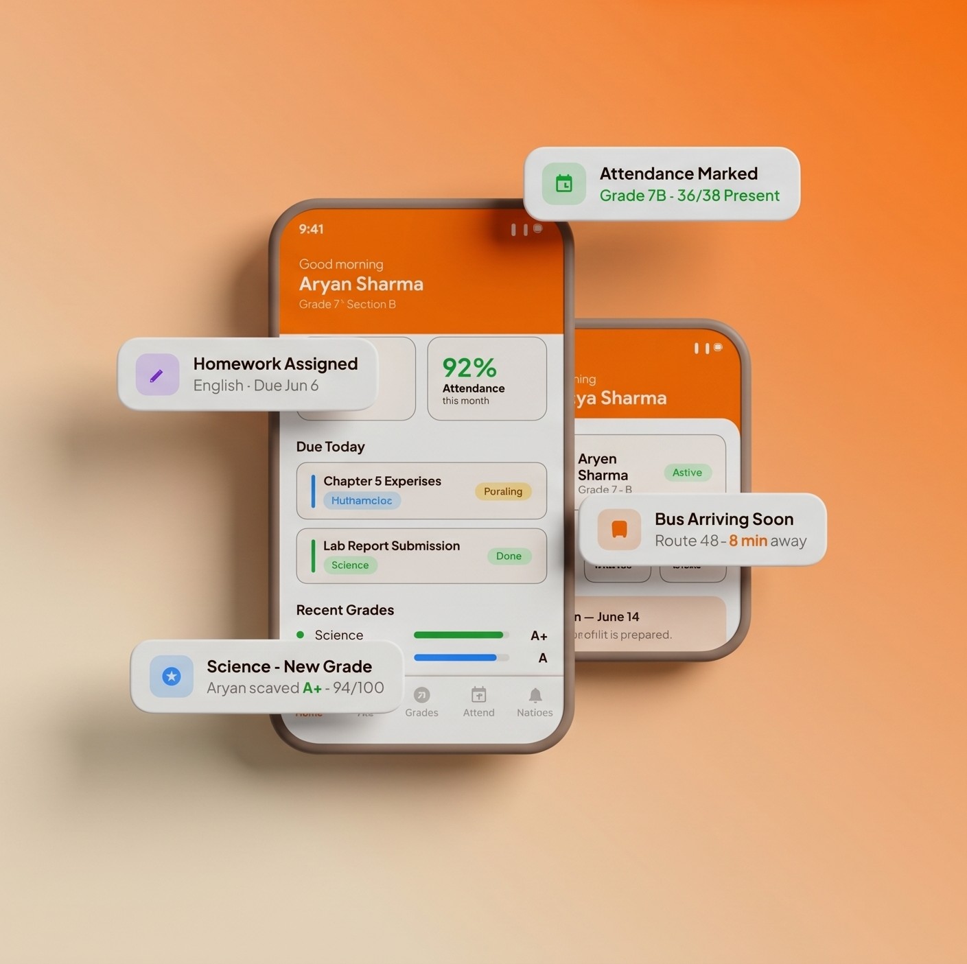
Unify parent views with clear attendance percentage charts, upcoming exam cards, and GPS-enabled push alerts ("Route 4B is 8 mins away") to guarantee child safety and complete transparency.
User Research & UX Audit
Before designing a single high-fidelity screen, I performed a UX audit of legacy school software. The findings were clear: systems suffered from severe information overload. The home screen held 12+ competing blocks, combining attendance bar charts, homework completion bars, gamified badge summaries, student leaderboards with gold stars, behavior donut charts, and notification feeds.
Teachers opening the app to perform a quick 5-second task (taking roll call) were forced to scroll past irrelevant dashboards.
Leaderboards and gold star tables on a teacher's home view served as visual noise rather than useful administrative utility.
Ambiguous fractions (like "24/60 Present") lacked baseline clarity. These were replaced by percentage indicators with semantic colors.
Key Features
Clean class progress meters, pending digital homework cards, and immediate teacher feedback loops. Keeps students focused and organized.
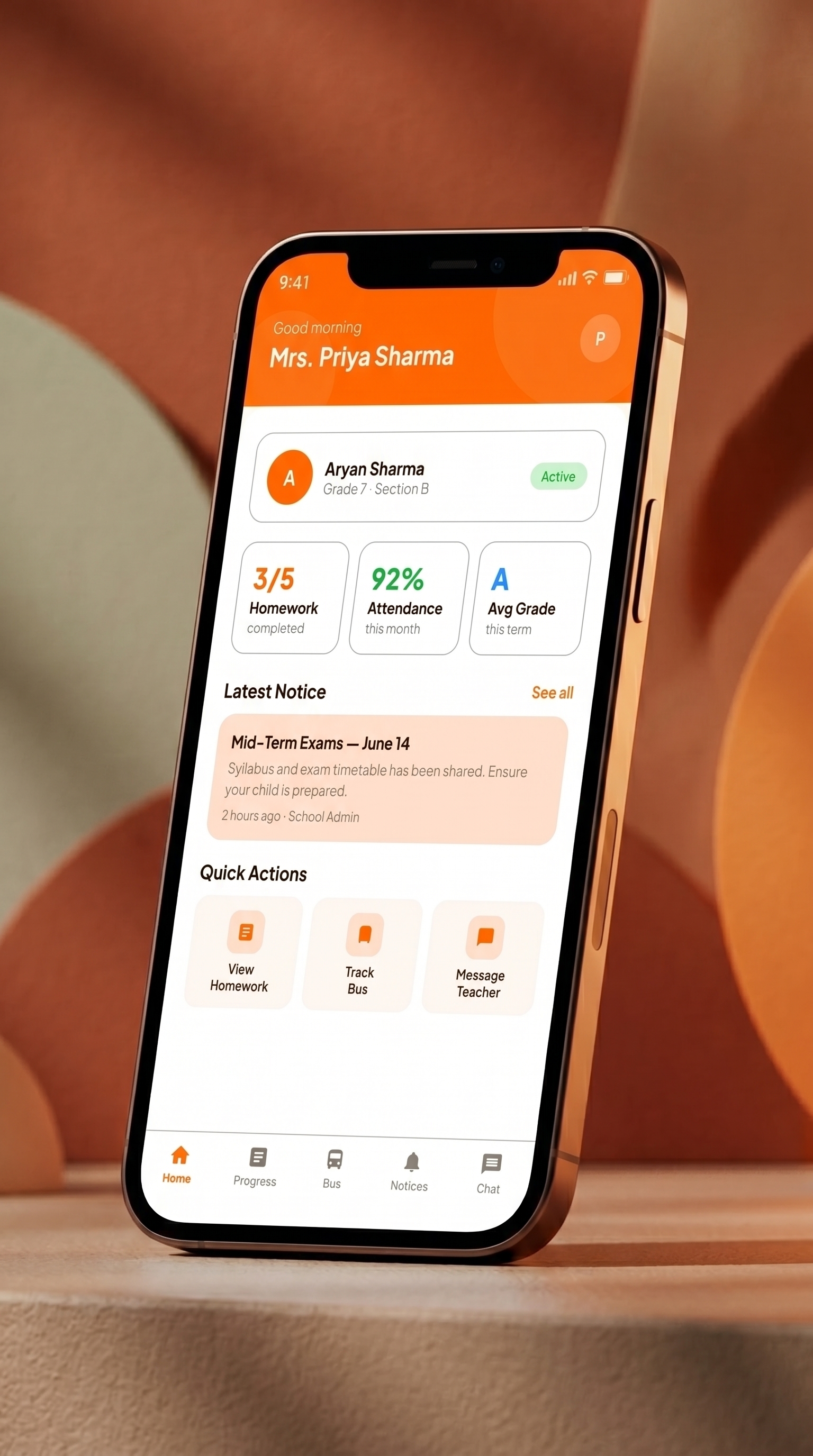
Switch between children profiles with one click. Clear attendance percentages, pending homework counts, and school event timelines.
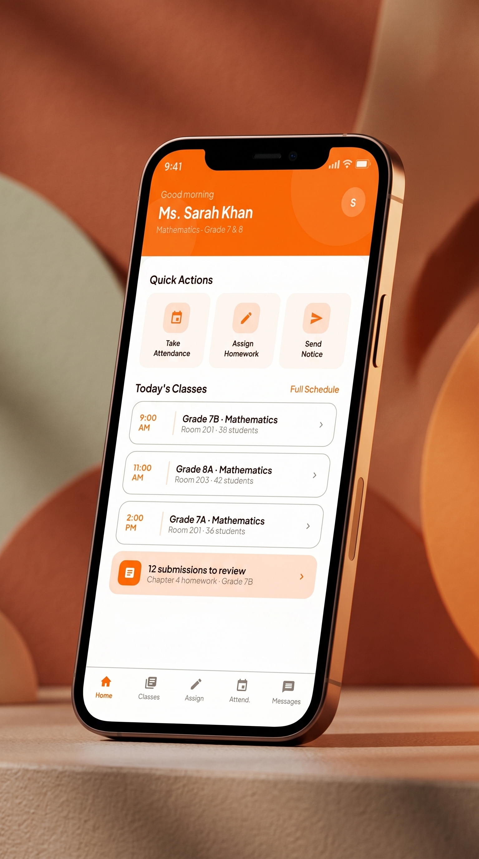
The streamlined 3-zone system. Quick-action buttons for roll call, homework assignments, and notice broadcasts, alongside a clear time-based class timetable.
Case Study Complete
SchoolBuds represents a transition from cluttered, legacy enterprise templates to a modern, responsive mobile SaaS portal. By resolving user pain points across three separate stakeholders (teachers, parents, and students), the platform achieves a balance between utility and visual delight.
Back to Projects